Skip to content

Before & after

The difference a considered redesign makes.

Drag each slider to compare the original site with the redesign, then read what changed and why it matters to a customer deciding whether to call.

01

Thoroughbred Brows

Live client

Brow studio, Newmarket

Olivia had the reviews and the results but no website — bookings lived entirely on a third-party app. Built from a blank page in Newmarket: an editorial, unhurried site that matches the quality of the work and sends people straight to booking.
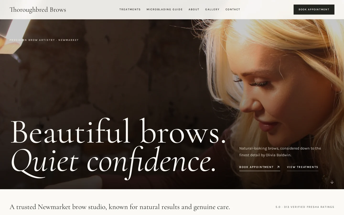
The Thoroughbred Brows website designed and built by Marin Website Solutions
Built from scratch — no previous websitethoroughbredbrows.marinwebsolutions.com

How it was built

Booking is the only ask
One repeated action throughout the site, wired into her existing booking system so nothing changed operationally.
Real proof, up front
5.0 from 313 verified ratings sits in the first screen instead of hiding on a review app.
Photography-led
Full-bleed imagery and generous space so the work sells itself before a word is read.
Found on Google locally
Structured for "brows Newmarket" style searches, with a microblading guide page pulling in early-stage searchers.
Open the live site

A real client site, designed and built end to end and live today.
02

Piping Hot Plumbing & Heating

Plumbing & heating, Suffolk

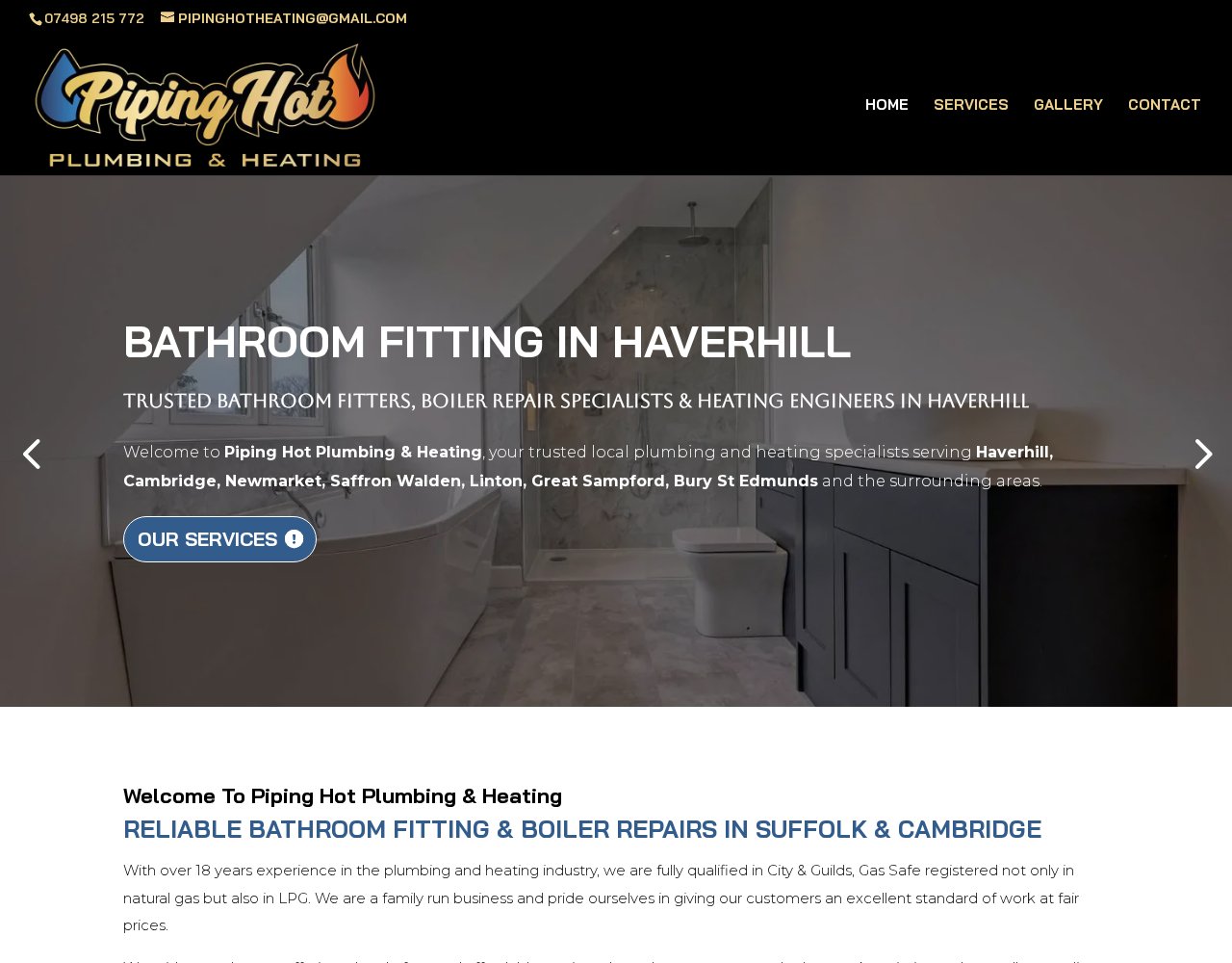
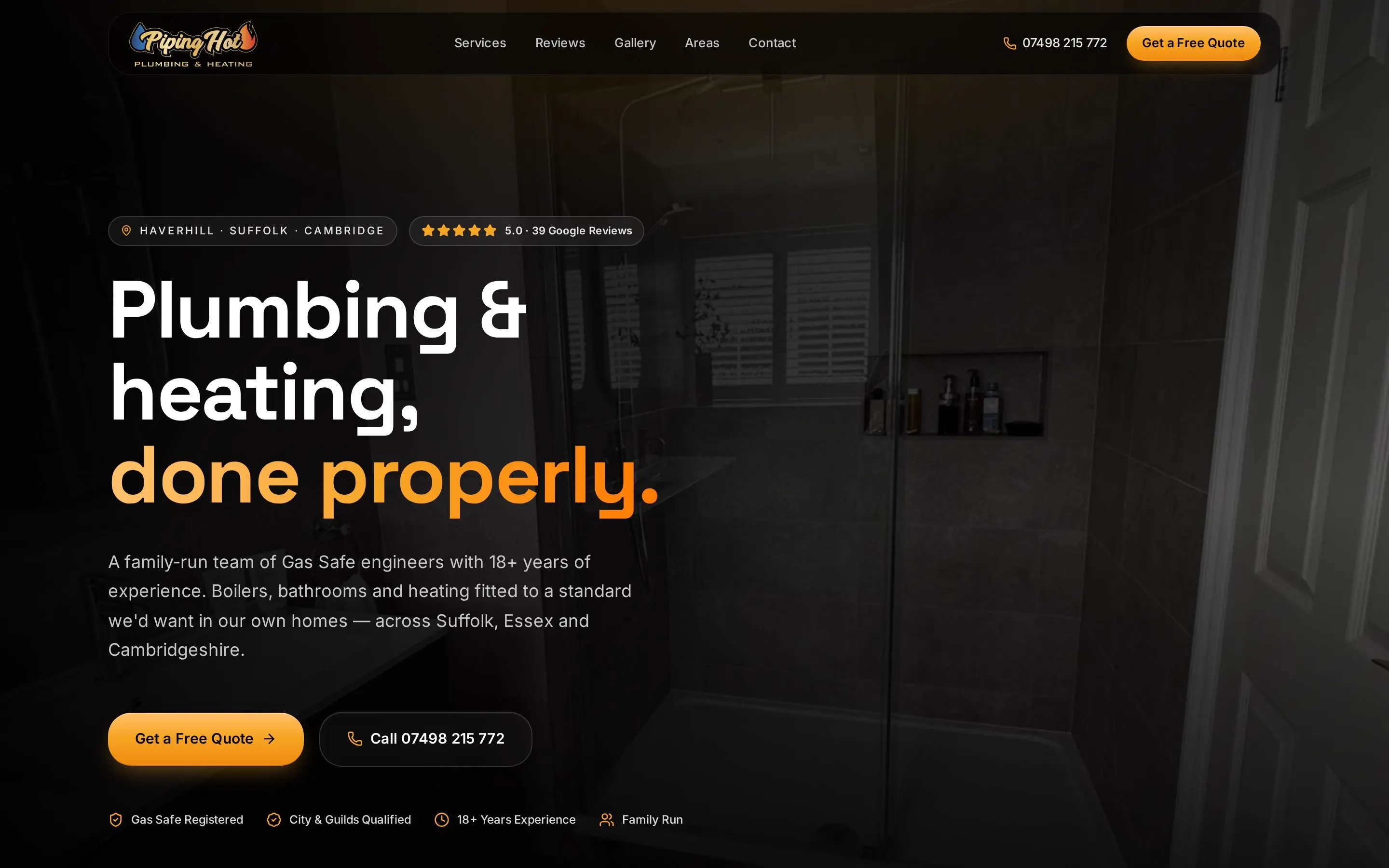
A long-established plumbing company with a site that looked older than the business deserved. I kept their branding and rebuilt everything around one question: how quickly can a customer decide to call?

The redesigned Piping Hot Plumbing & Heating website built by Marin Website SolutionsThe original Piping Hot Plumbing & Heating website at pipinghotplumbingandheating.uk, before the redesignBeforeAfter
Drag to compare
Original: pipinghotplumbingandheating.ukRedesign: pipinghot.marinwebsolutions.com

What changed

Phone number in reach at all times
Click-to-call sits in the header and repeats after every section, so nobody has to hunt for it on a phone.
Services made scannable
Long paragraphs became short service blocks a homeowner can read in ten seconds.
Proof moved up the page
Accreditations, years in business and reviews now appear before the fold instead of buried on a sub-page.
Rebuilt for phones first
The old layout collapsed awkwardly on mobile, where roughly three quarters of their visitors arrive.
Open the live redesign

A concept redesign, built independently to show how I would approach this business.

03

Peachey Magic

Professional magician, East Anglia

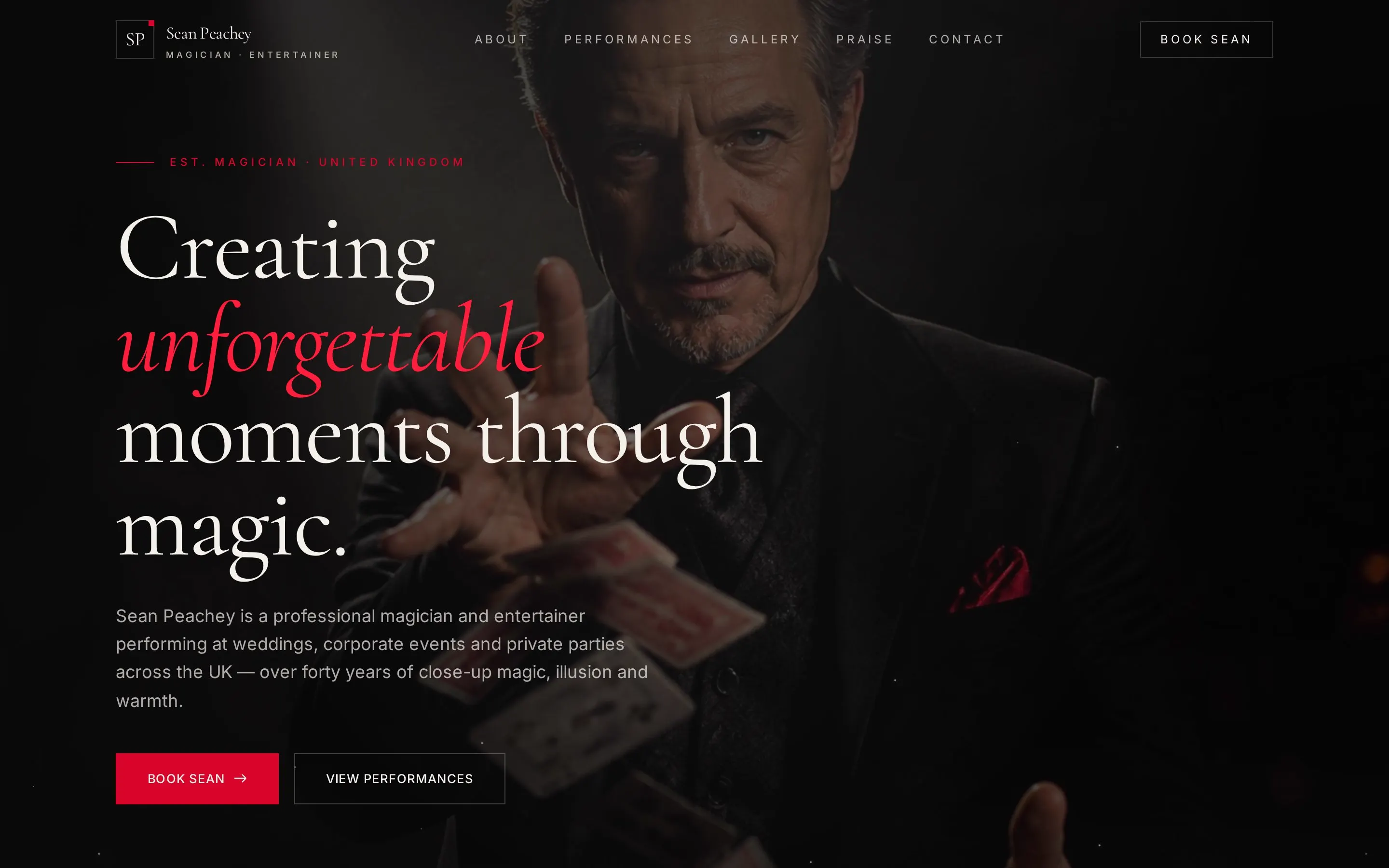
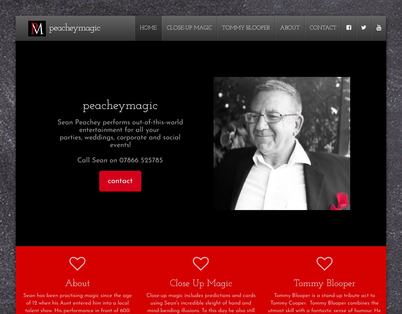
Entertainment is sold on atmosphere. The original site described the act; the redesign lets you feel it, then makes the booking enquiry the easiest thing on the page.

The redesigned Peachey Magic website built by Marin Website SolutionsThe original Peachey Magic website at peacheymagic.co.uk, before the redesignBeforeAfter
Drag to compare
Original: peacheymagic.co.ukRedesign: peacheymagic.marinwebsolutions.com

What changed

Photography given room to breathe
Full-width imagery replaces small thumbnails so the performance sells itself.
One clear booking path
Every section ends in the same enquiry step instead of scattering contact details.
Typography with a point of view
An editorial type scale replaces default fonts, which instantly lifts the perceived price of the act.
Faster on a phone
Compressed imagery and less clutter mean the page is usable before an impatient visitor leaves.
Open the live redesign

A concept redesign, built independently to show how I would approach this business.

Yours would get the same treatment — built around your customers, your trade and the way people in your area actually search.

Start with a free homepage concept
Gabriel Marin, who designs and builds every Marin Website Solutions site

See your homepage before you pay anything.

Tell me about your business and I will design a real homepage for it. If you like it we carry on. If you don't, you have lost nothing.

No upfront payment · Usually a reply the same day · Live in one to two weeks